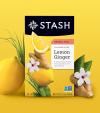
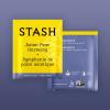
The mark, called “the Compass”, hints at their nautical past while being adorned with tea leaves.
Over a year’s worth of research, designing, testing, and launching led us here.
The packs themselves needed to have their own individual flavor identities while also feeling like a family.
We did this through a consistent design foundation, stunning photography, bright and unique colors, and a design that makes you curious to keep twirling the box in your hands.
The tea envelope itself is one of those important parts of the tea experience. Most tea envelopes are separated from their box counterparts and appear on their own, making each tea envelope a brand ambassador.
Stash’s previous flavors were defined by a single color that limited how new teas would be added to their ever-growing catalog.
Our solution was to introduce a two-color system to broaden the brand’s color palette and to define flavors via color combinations.
↓
Stash Tea
Rebrand and Packaging
Created in 2017
↓
Created at Jolby
Client: Stash Tea
Creative Direction: Colby Nichols
↓
View project on:
Jolby Website


