Pinecone Childcare
Brand Identity
Branding for Pinecone – a new childcare space in Portland, Oregon.
Pinecone provides a modern approach to early childhood learning merging Waldorf, Montessori and Reggio philosophies.
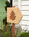
Their brand identity is inspired by kids’ paper cutouts and vintage scandinavian illustration.
The wayfinding in the daycare building uses iconography in the signature Pinecone cutout style. Here’s two bears to indicate where the cubbies are. →
← A poster placed by the entrance gives parents an overview of Pinecone’s combined philosophy.
(Fun fact: The info graphic is shaped like the underside of a pinceone.)
Pinecone’s logo is quite literally greeting kids and their parents with a smile.
The slogan we developed for Pinecone is“Childcare done nicely.” It plays on the beautifully crafted facilities and the friendly environment for the little ones. →
The color palette is subtly vibrant while at the same time providing calmness and sense of natural well-being. →
A set of icons helps illustrate Pinecone’s approach. The typeface“Fautive” is used throughout all of their communication. →
← The Pinecone garden features a mural we planned and painted. It helps create a fun wonderland to play in.
↓
Pinecone Childcare
Brand Identity
Created in 2024
↓
Creative Direction, Design & Illustration: Philipp Zurmöhle at Transatlantika
Client: Pinecone Childcare
Photography: Philipp Zurmöhle
Signage Production: Miracle Sign Co
Car Wrapping: PDX Wraps
↓
“Childcare done nicely.”


